Visual design is one of the first ways people learn who we are. Before they read a single paragraph or attend an event, they see something we’ve created—a color, a texture, a headline, a face.
That moment carries weight. It communicates not just information, but intention. And for a mission-driven company serving underrepresented communities, that intention must be grounded in integrity.
And where do we begin embedding integrity into our visual identity? With truth. When I sit down to design something, I’m always thinking about whether it reflects the real world our community members live in. Visual trust comes from empathy & honesty, rather than a polished or distant version of someone’s experience. It begins with an image that feels familiar, human, and respectful.
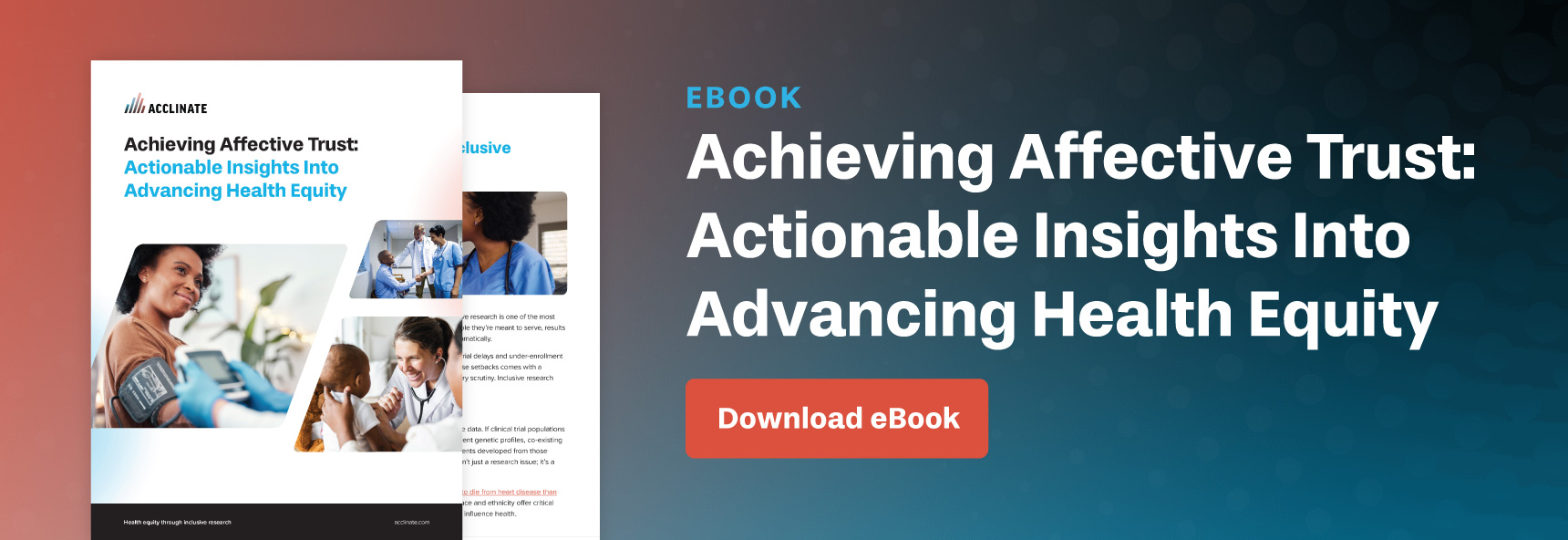
Creating Health Equity Designs With Honesty at the Center
When I define integrity in design, I think about honesty and moral strength. That shows up in the way I choose photos, build layouts, and write visual messages. I want our materials to reflect the lived experiences of real people, not an abstract clinical idea of what a condition is “supposed” to look like.
A clear example of this approach is the design set I recently created about allergies. Before touching the design, I researched how perennial allergic rhinitis affects people day to day—beyond the medical definition to how it feels emotionally to avoid dust, pets, or certain environments.
That in-depth research is what led me to conceptualize visuals that show real frustration, real tenderness, and real connection. For example, one design featured a girl wiping her nose while her dog sat beside her. The message was simple: hanging out with your best friend shouldn’t be a struggle.
That’s the kind of truth that helps people feel understood.
“When I define integrity in design, I think about honesty and moral strength. That shows up in the way I choose photos, build layouts, and write visual messages.”

Why Trust Has to Be Seen to Be Believed
Representation is a form of respect. When someone looks at a design and sees someone who moves through the world the way they do, it signals understanding. It also signals accuracy. Communities who have historically been left out of healthcare conversations deserve to see themselves reflected in the materials asking for their trust.
I feel this concept personally. When I see a poster featuring real people who look like me, it makes me more willing to engage. It tells me the creators didn’t treat me as an afterthought. At Acclinate, we never design from the outside looking in. We’re community members too—and that influences everything from our photo selection to our messaging.
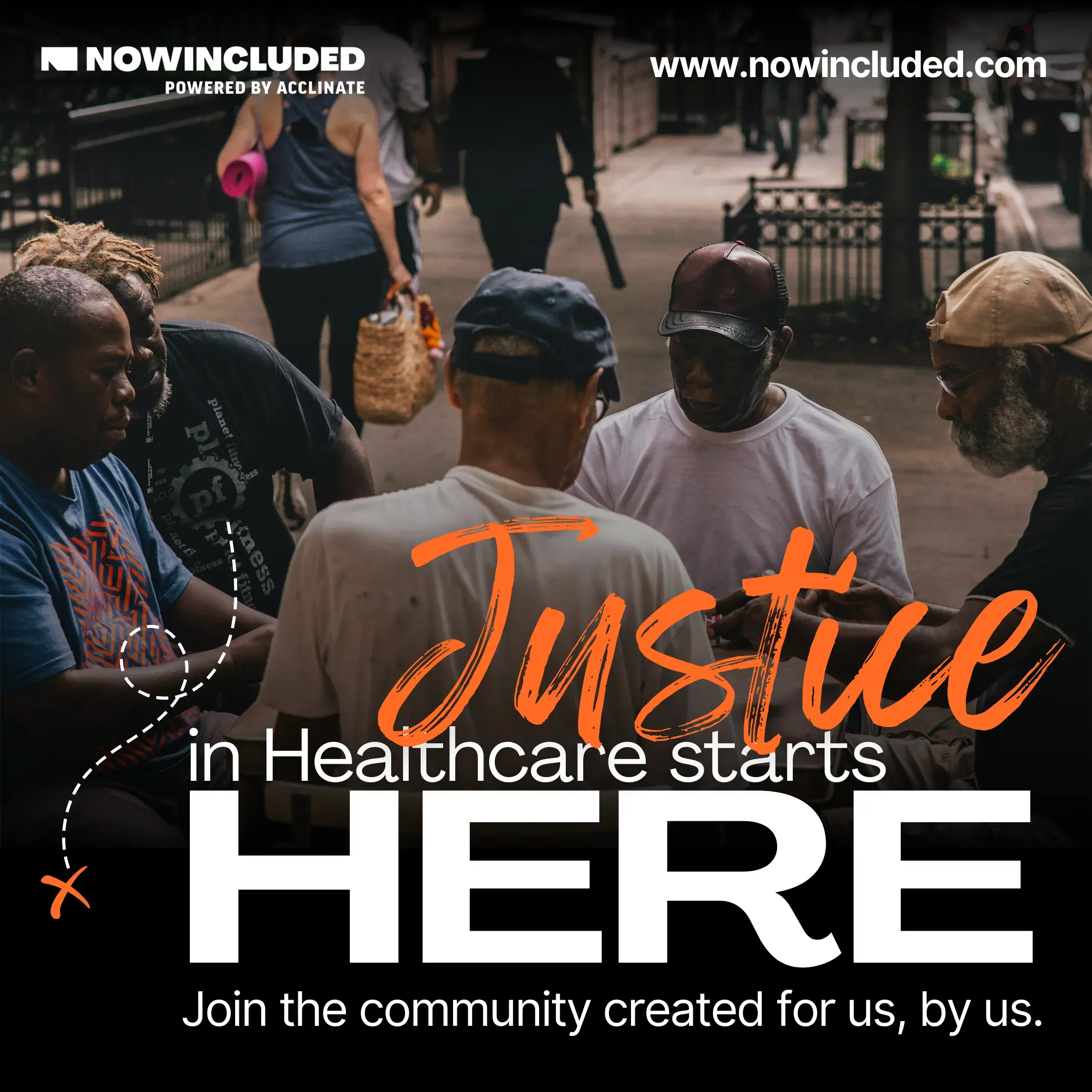
One of my favorite examples is an early foundational NOWINCLUDED design. We featured a group of older Black American men playing cards with the message, “Justice in healthcare starts here.” It worked because it came from a real cultural moment. Playing card games isn’t a trend for us—it’s connection, neighborhood, and tradition. The ad became one of our strongest performers because people recognized themselves in it.
Ensuring Words and Images Tell the Same Story
Design tells a story, and copy tells a story. They need to move together. If our message is empowering, the image needs to feel that way. If the goal is to educate, the tone needs to be clear and supportive. When those two elements match, they create an experience people can feel.
So, before I even open a design file, our content and marketing teams align on strategy. What do we want someone to feel? What behavior are we encouraging? What does the community need at this moment—reassurance, clarity, validation? Starting there keeps the visuals honest and unified.
The Design Details People Don’t Always Notice
Typography matters. Color matters. Texture matters. They may seem small, but they shape how a message feels.
For example, we use the Agrandir font family because it’s bold, structured, and a little quirky—a balance that mirrors our brand personality. I also introduced a script font with visible brush strokes because it carries a handmade quality. You can see the imperfection in it. That imperfection signals humanity, which is at the heart of how we want people to experience Acclinate.
Colors work the same way. Our gradients vary across conditions and campaigns, but the emotional tone stays consistent. Even when a palette shifts, you can still sense the NOWINCLUDED identity through hierarchy, texture, and warmth.
Knowing When a Design Is “Done”
Metrics help, but a lot of my creative instincts come from toggling between two roles: designer and consumer. I ask myself, “Would I click on this? Would this make me feel understood?”
When the answer is yes—and when changing anything would only take away from clarity—that’s when I know a piece is complete. Some of my favorite designs are simple. Clean. Direct. They don’t fight for attention but communicate their messages first and foremost.
Growing Creatively While Staying Rooted in the Brand
Even though I’m a designer now, I started as an artist. Creativity shows up for me in painting, crochet, Pinterest scrolling, and paying attention to billboards, packaging and tv ads when I’m out. Staying inspired means staying curious—but staying aligned with the brand means staying grounded in our mission.
Design is experimentation, but it’s also listening. I often ask people, “Would you click on this?” Their answers help me learn what resonates with our community right now, so that when trend reports come out telling me what people want, I have the best proof point of all: real feedback from real people.
That’s how we keep the brand fresh without losing who we are.
Why Visual Integrity Matters for Our Mission
Acclinate’s mission is to help underrepresented communities take action toward better health. That work depends on affective trust — the emotional trust that grows when people feel seen, respected, and understood.
Acclinate’s mission depends on Affective Trust—the emotional trust that grows when people feel seen, respected, and understood. Design is part of how we build that trust. It’s an invitation for someone to see themselves in a health conversation where they may have never been acknowledged before.
When design reflects real people, moments, and truth, it opens the door for action. It helps someone say, “This is for me.” And that moment—that spark of recognition—is where better health begins.
Want to dive deeper in our novel design approach? Schedule a 1:1 with our team.